Weymouth Football Club launches a new visual identity.
In line with Commitment 1 of Vision140, to set new standards for how the club operates, we are pleased to unveil our updated and aligned visual identity for the club moving forward.
For Vision140 to succeed, the way we present ourselves has to match the standards that we will build behind the scenes. Clear, consistent visuals help show players, families, supporters, sponsors, and the wider town that the club is a place where standards matter.
")
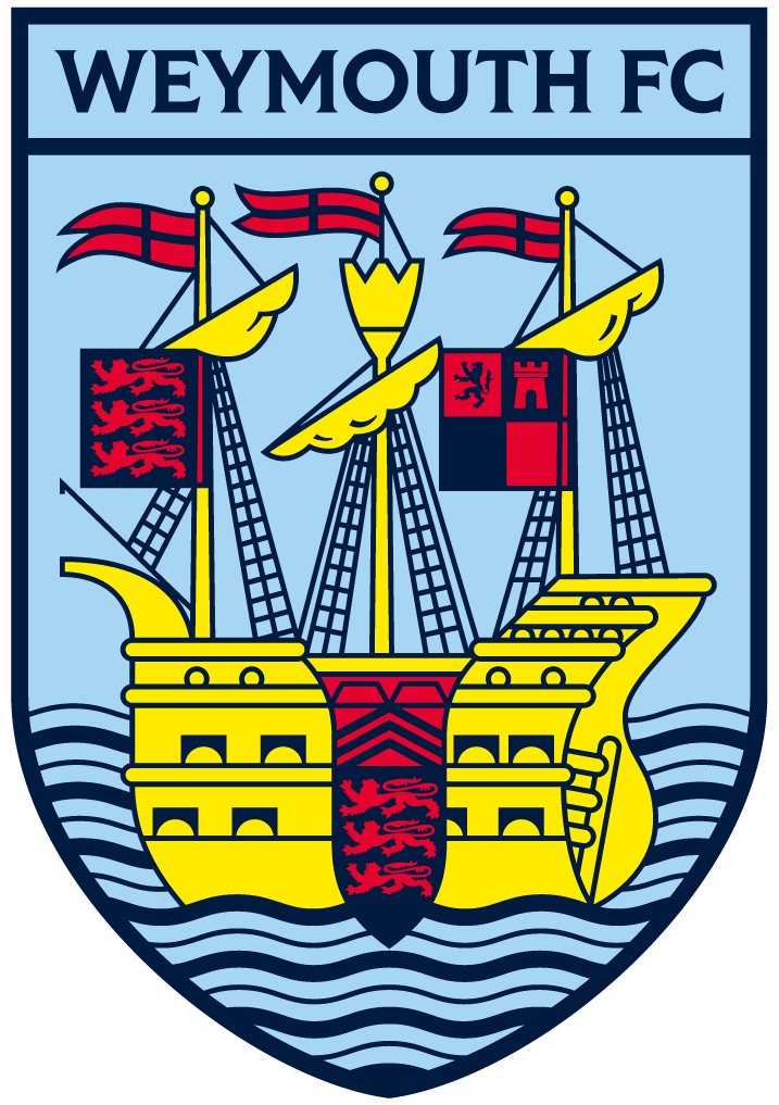
Crest
At the heart of the updated visual identity sits our restored crest. It remains instantly recognisable as Weymouth Football Club, while bringing the club in line with the demands of the modern game and the digital spaces where the crest now needs to live.
The restoration improves legibility, strengthens real-world application and carefully remasters elements of the crest that had become lost, distorted, or weakened over time. The result is a badge that better reflects the pride, history, and standards of the club, while carrying forward the identity supporters already know.

WFC Shield
Alongside the crest, we are introducing a new secondary logo designed to support the club’s visual identity.
Using the shape of our crest with WFC held in the negative space, this mark gives the club a simpler and more flexible way to display ourselves clearly across smaller real-world applications, where the detail of the full crest can become harder to recognise.
The crest remains our primary badge and the main symbol of the club. This secondary logo simply complements it, helping us maintain consistency and recognition across every touchpoint.

Jubilee Anchor
Expanding our suite of logos beyond the crest gives the club greater flexibility across the visual system, allowing us to create more variety while still feeling consistent and recognisably Weymouth FC.
The Jubilee Anchor brings together two familiar symbols of the town: the Jubilee Clock and the anchor that sits beside the Pavilion. By combining them into one mark, the logo creates another clear link between the club and the place it represents.

Wordmarks
The identity has also been extended through a series of wordmarks, giving the club more ways to communicate while still feeling clearly connected to the wider visual system.
The arched structure, type style, and dots on either side take reference from the Brewers Quay arch at the harbour, creating another subtle link back to Weymouth. Across different formats, from signage and merchandise to digital and social use, the wordmarks
help us express the identity with more variety without losing connection to the town and our club.

Ben Miller, Head of Media and Marketing:
"I cannot overstate the importance of this work for Weymouth Football Club. Vision140 is about raising standards across every area of the club, and our visual identity is a key part of that journey.
When I joined, it was difficult to identify the correct visual assets the club had. That is not a reflection on the work that people were doing, just a result of high turnover in media roles and the lack of a single set of assets. This work provides that, and safeguards the club's identity outside of any individual.
This work gives us a clear, professional, and unified identity that reflects where we are heading as a club. It is born from our desire to respect our history and connect deeper with the town.
Every element has been carefully considered, from the restoration of the crest to the introduction of supporting marks, to elevate the club, whilst remaining respectful to our heritage.
This is a direct output of the Fan Insight Project and a wider strategic review. I may have led this review and project, but I need to thank everyone who contributed, either in-person sessions or by completing a form. That insight has been incredibly valuable.
I also want to thank the Board of Directors for being so open to the idea of change, and supportive and transparent throughout the entire process.
Finally, I'd like to thank Marcus personally. The work he has put in over the last few months to support the visual identity and Vision140 has genuinely been priceless. Having someone so committed, talented, and patient has been a key factor in us delivering this piece of work."
Marcus Dilley, Dilley Studio Founder:
“Having been fortunate enough to work within the pro game, it means a lot to bring that experience back to my hometown club and support Weymouth FC at such an important stage.
This was never just about designing new marks. It was about aligning everyone at the club to shared goals that will help guide the future decision making. The visual identity is there to support Vision140, giving the club a clearer and more consistent way to express what it is working towards.
Credit to the club for being willing to look at the bigger picture, for making honest assessments and taking the first steps in committing to a vision. Now the hard work begins to turn that vision into a reality”